I saw the sign. It opened up my eyes. I saw the sign.
Life is demanding without understanding.
 I recently came across the Accessible Icon Project and an article written by Sara Hendren, an artist and activist from Harvard’s Graduate School of Design. Hendren describes how for years she had collected alternative designs to the standard blue and white stickman with wheels we all know for designating ‘handicapped’ spots in parking lots. That symbol is the International Symbol of Access (ISA) and has become ubiquitous across the American public landscape at least since the Americans with Disabilities Act was signed into law in 1990.
Over time, Hendren collected a few alternative versions that had what she called ‘more design integrity’ and was frustrated that these variations were so rare. For her, the presence of alternative designs helped draw her attention to the docile, passive, and decidedly inactive person represented in the ISA symbol. By writing about these issues for her blog, Hendren eventually teamed up with Brian Glenney, a philosophy professor at nearby Gordon College. Glenney had maintained an interest in how developments in assistive technologies do not necessarily indicate a greater acceptance of AT users in the broader public arena. 
Hendren and Glenney conspired to wage a grassroots street art campaign to get questions related to physical access into the public consciousness. The local art campaign was an example of design activism—a form of activism that uses symbols, artifacts, or media to create questions, proposals, and provocations. The goal is to further the question rather than to fix the problem. However, the groundswell of support and interest from more pragmatically minded advocates and collaborators pushed their street art project into a much more official standing.
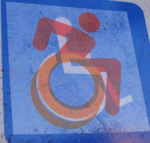
Hendren and Glenney worked together with other activists in the Boston area and eventually developed a clear sticker that could be laid over existing parking signs. They first wanted to cover the old images completely but realized that when they did so, people did not recognize the change. The new image was not itself remarkably different enough to notice. They eventually settled on the clear back and orange sticker that could be laid over the ISA to show the juxtaposition.
 The clear backed sticker helped make people who generally do not consider people with disabilities to question why there were two symbols. The public nature of the campaign also brought in curiosity from journalists who helped some self-advocates get their opinions and experiences into the public arena.
The stream of support developed into a bona fide social design project: The Accessible Icon Project. From their website:
“The icon is genuinely global now: in hundreds of cities and towns, at private and public organizations, used by governments and by individual citizens. We never, not in a million years, would have anticipated its growth when we first started.”
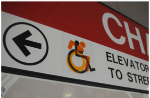
 It began as street art but then developed into a standard graphic design project. After gaining notoriety for the activism and raising the question, Hendren and Glenney were faced with varied international groups who wanted to use the icon. With the help of graphic designer Tim Ferguson-Sauder, they now have their icon in the public domain and readily available for any organization/school/company that wants to use it. It is the current design choice for several towns and cities (most notably New York City), universities, and is on display at the New York Museum of Modern Art (MoMA). The modified symbol also has a section on the ISA’s Wikipedia page.