“We are stuck with technology when what we really want is just stuff that works.” –Douglas Adams.
Adams, the author of The Hitchhiker’s Guide to the Galaxy series, further argued that once a technology starts working, it ceases being technology and is instead part of the natural way of the world. It’s no wonder that one of the greatest examples of assistive technology—the eyeglasses—were long ago accepted as natural by most of us.
In the past few decades, computers and the Internet have changed our classroom expectations by increasing our access to information, resources, and other people. As digital media develop and grow, there is an increasing push to ensure that all people have equal access to digital content regardless of their physical abilities. Accessible design is quickly becoming a top priority as businesses, universities, and organizations have seen the best bet for the future is designing content that is accessible to the largest swath of people for the longest duration of time. Accessibility includes creating course materials and using websites that are designed in a logical and intuitive way so they can be used as effectively as possible.
I’ve found five different resources available for free that anyone can use to assess websites and documents they use every day. These tools are easy to use and quickly reveal information about web design and how assistive technologies work with that design. Here are “5 Tools to Help You Better Understand Accessibility”:
 Sim Daltonism
It is very difficult for those of us with adequate sight to understand how important color contrast is in our everyday life. Sim Daltonism is a color blindness simulator for your Mac or iOS device that overlays a colorblind filter on your display. On your Mac computer, you can move the window onto particular elements or make your entire screen as a colorblind person would see it. The iOS version will work on your camera so you can experience the world around you as a color blind person might. Sim Daltonism also includes 8 different types of color blindness depending on which cones the person can use.
 NoCoffee
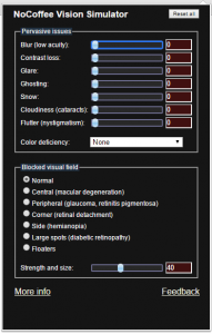
While colorblindness is one common vision deficiency, it is not the only example. If you’re looking for a vision simulator to better understand other peoples’ visual experiences, then there are other options. NoCoffee for Google Chrome is a fantastic plugin that contains colorblindness filters and other vision simulations. It offers over a dozen simulators for pervasive vision issues and blocked visual fields to estimate the experiences of many different kinds of users. The tools are very responsive and the browser changes as you manipulate it. Also by using sliders, NoCoffee allows you to change the severity of the defiency and use multiple afflictions in combination.
 webaim.org
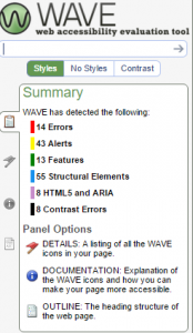
If there’s a website you use regularly and would like to know how accessible it is, you can use the ‘Wave’ tool created by WebAIM. Go to wave.webaim.org and enter in the URL for any site you like. It will navigate to that site and open up a sidebar where the results of its test are displayed. The individual elements of the page are indicated and you can move item by item or error by error through the page. The test also offers a short explanation for each infraction and a link to the WCAG guidelines in question. If you find this useful and intriguing, they offer a toolbar add-on for Chrome.
 tota11y
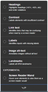
The non-profit organization Khan Academy teamed up with MIT and created ‘tota11y’—a free plugin that works with Firefox, Chrome, and Safari. They describe the plugin as ‘an accessibility visualization toolkit’ that helps users understand how any site would perform with assistive technology. The plugin’s simple design lets you activate it with a few clicks and it will display all of the headings, links, alt-text, etc., so you can imagine how a screen reader would group the content and navigate the page. Also their website has the plugin activated so you can test it out and see how it works before downloading anything.
 Colour Contrast Analyser (CCA)
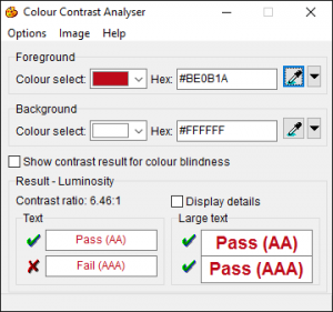
The Paciello Group offers this free tool for Windows and OS X (and in many languages) to determine the contrast and legibility of visual elements including text on color. The WCAG standard ratio is 4.5:1 and with this tool you can select the individual colors used on your screen and compare them to see the ratio. There are many similar tools for web design but the CCA lets you pull colors off the screen which makes assessing existing content much easier.
These tools are designed for users with varying degrees of technical experience. If you are a web designer or add content to a web page, then these tools can be used to make sure your website is accessible. If you are a professor, these tools can tell you about the structure, layout, and design of web pages and documents you use every semester. Most importantly, these tools are easy and fun to use, so try them out and see what you find! Experiencing your computer and the Internet with an eye towards accessibility can show you a brand new way of understanding the medium.
If you have any questions or comments about these tools or any accessibility issues, please send them to accessibility@olemiss.edu.
Tags: Accessibility