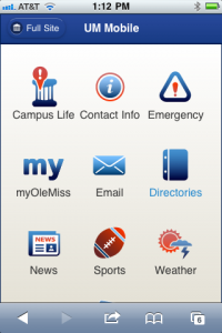
The UM Mobile site recently got a completely reworked layout. Looking more like an app than a mobile website, the new layout features icons at the main and some secondary levels to make navigation easier. Behind the scenes, the visitor’s screen resolution is used to guess which version of the site (mobile or full) that he or she will want to see. Screens smaller than an iPad’s 768 pixels are automatically shown the mobile site while larger screens get the full site. Visitors have the option of choosing to see the other version, as well. Once they do so, the server writes a cookie to their device so they can remain in that version across the site.
Expect to see more sites added to UM Mobile as more of our sites become mobile-ready.
Tags: Mobility