
Final designs for UM home and secondary pages
You may have heard rumors that we are in the process of redesigning the UM website. You may have even taken part of one of the focus groups that provided input on what a design should include. Perhaps you were one of the people who provided feedback about the design concepts in our survey last September. Or, maybe this is all news to you and you’re thinking “What website redesign?” Whatever your involvement, we appreciate your help (…except for maybe that last group). We are well on our way to implementing the new design.
Two Phases
The structure of the website partially reflects the overall structure of the university. The UM homepage promotes the university itself, while “departmental” sites represent the colleges, schools, and organizations that make up the university. The website will be upgraded in two phases. The first will address the UM home and secondary pages and should be completed on April 13. The second phase will begin in early May as departmental sites are assisted in their adoption of the new template.
Trusted Friends
Although the university’s Web Planning Committee came up with the main structural components of the site, and University Communications created the initial concept designs, we turned to a professional design company, Mercury Intermedia, for the final design. This same company created the Official Ole Miss App and we chose them because we wanted the style of the new website to reflect that of the app. Working with people outside the university has not only helped us refine our broad concepts into more functional content organization and better use of screen real estate, but it has also provided opportunities where we could strengthen the website’s overall usefulness. Here are just a few of the paradigms we’re exploring this time:
- The primary focus should be on potential students and others interested in learning about us. In the past, we’ve promoted all our audiences equally. But more thoughtful design suggests it is best to cater to the people who are most likely to go elsewhere if they can’t find what they need quickly. By dedicating primary navigation and promotional areas of the page to those visitors, we can hopefully grow our base.
- Assume everyone else is more committed to finding what they need. Our current students, faculty, and staff already have a sense of what they are looking for, and they are willing to take a few extra seconds to learn where it is. This frees us from having to crowd the top of the page with shortcuts and links that most anonymous visitors can’t even use (e.g., myOleMiss, Blackboard, etc.). We trust our core users will be able to find their most commonly used links lower on the page. And if they want to have even easier access to those links, they can set bookmarks in their browser.
- The design needs to be almost invisible. This Zen-like approach allows the content to stand out by avoiding the use of distracting graphics in the layout. Of course the graphics, fonts, text sizes, and spacing are all there, but they should feel natural, almost too obvious to even notice. Comfortable spacing and proper alignment help the reader’s eye to move more easily from one area to the next.
Design ≠ Website
Mercury designers have provided us with Adobe Illustrator files showing how the pages should look on different sized screens. It is the job of the Webmaster (with the generous help of others in IT) to go from those designs to functional Web pages. Much of the home page will consist of content generated by feeds from Ole Miss News, the Event Calendar, Twitter, and UM Today. University Communications is revising and, in many cases, creating new content for the dozens of secondary pages.
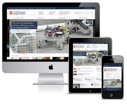
Responsive design means a single website adjusts to the size of the device on which it is being viewed.
One major change coming is that we will no longer support a separate mobile version of the website. The new layout will, instead, use responsive design and progressive enhancement techniques to present a fitting layout for whatever browser visitors use, whether it be a mobile device or a high-definition monitor. Through the use of HTML5, CSS3, and Javascript, we are in a position to have much better control over the visitor experience.
Obstacles to the “Bleeding Edge”
In 2009 during our previous site redesign project, we had to consider the browser limitations of the majority of our audience. At the time, over 65% of our visitors used Internet Explorer, and IE8 was released only in March of that year. IE6 and IE7 were recognized even at the time as failing Web-standards testing. (IE8 is somewhat better.) This situation made it difficult to provide a common look and consistent functionality across our entire audience base. So it is a great relief to see that only 12% of our current visitors uses IE8 or lower. Even though Google dropped support for IE8 in November, we still need to provide at least partial support for it. This means there are still some new techniques that we still aren’t able to fully implement because IE8 and some other browsers don’t yet support them. Still, whenever we are sure we won’t be facing one of those browsers, like on mobile devices that don’t have IE, we’ll try to “sneak in” a few neat tricks!
If you are an Internet Explorer user and you aren’t yet using IE9, it’s a good time to consider either upgrading or switching to browsers that respond better to the modern Web environment like Safari, Firefox, or Chrome.
Search UM
Another big change is how you find things. The new Search UM application has combined most of our Web index and directory listings into a single search field. And because it returns many different categories of results, adding the Search UM form to every page frees us from having to waste space by linking to several separate directory listings. Simply enter what you’re looking for and you can jump from one part of the site to another.
In with the New
We are looking forward to implementing the new home page design on April 13. A lot of time, thought, and creativity has been put into it, and we think you’re really going to like using it. If you have a couple of minutes, you might want to look back at past site designs we’ve had to get an idea of how technology and tastes have changed over the years. Soon, the current UM site will be retired to that archive as well.